Thursday, 23 February 2017

Interesting life drawing challenges

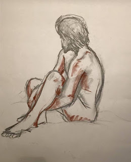
We began with some quick 30 second rough gesture sketches to quickly get down the shape of the model using lines of action. I found this really helpful to put the full figure in an interesting pose onto the page really quickly.


We then had a go at drawing the model as though it was drawing frames of an animated character.


We also tried blind contour drawing which I thought was amusing when I looked back at my paper. I don't think I've quite grasped this one yet but I'm sure more practise looking away from my page will help me to draw better. We also did a collaboration drawing where we drew on each others drawings around the room which I found fun as I could see where I would make changes on other drawings as well as understand how I could improve my own drawing.

After drawing the model in full for 15 minutes we had a go at drawing a caricature. I found the change of drawing realistically to stylised quite difficult but hopefully with more practise I can improve my stylised drawings.


Our final drawing used black paper and focussed on the light in the room and how to create the character using tonal value rather than drawing an outline of the figure. I quite liked this exercise as it helped me to see the contrast in the lighting around the room. I think if I were to have another attempt at this exercise I would use more white as I did in the previous session and work into it with charcoal. 


Tuesday, 21 February 2017

Life drawing


We had another go at drawing the model in two halves this week, I think I still struggle with drawing this was as I can't get the proportions right.


After drawing the model in separate halves, coming back to drawing the full figure on one sheet I was able to draw the model in better proportions. I used a new technique on black paper where I filled in using white chalk and went back into the drawing with charcoal to show the shadows and darker contours. I really like the effect it creates. 

Thursday, 16 February 2017

Outliner


The robot model for our eco project is to be rigged and textured by someone else in our group which is why I have made sure that my outliner is kept neat and everything is named. I find it helpful for myself to keep everything in order.


Robot eyes


I've been messing about with the robot trying to create some eyelids and eyes that would suit our robot - TX392. I'm finding it quite difficult to find eyes that match and aren't too realistic but I guess the light that's meant to be in the eyes can be added later on which will make them look like robot eyes. 


Robot modelling

For our Eco brief we decided to have a robot character who explains the changes that occur in the future. I was given the turnaround for the character which I have attempted to model in Maya.

(Turnaround and design by Amy Lucas)


I think my model has turned out quite well as I have put what I've learnt about modelling from last year, the third years and online tutorials into practice for this model. The one thing this model is missing is the turbine on the chest which is shown in the character turnaround. 

Character modelling

For the crew project the third years gave me the opportunity to have a go at character modelling. I found this challenging but fun and I think I enjoy box modelling. From this task I learnt how to create human eyes, an overall character shape, how helpful edge loops are at defining areas of a character, how to join limbs onto the main body and much more. Before modelling this character I used a tutorial on pluralsight by Justin Marshall to learn the basics of creating a character in maya which was a little space man. I found this tutorial really helpful as I could understand how a character was built up from just cubes.

I followed this turnaround that another member of Dino Diner designed. I think my model came pretty close to the design however I need to finish sculpting this character in mudbox which is something I am currently working on.


I think I have improved from my modelling in semester one when I had only just begun modelling props. I made a couple of mistakes with edges and edge loops when I began as I deleted a lot of them which meant it wouldn't be possible to add textures later on. I had a second attempt at modelling the same chopping boards which were much better meshes. 


We also had a tutorial held by the third years to learn about how to model and the best ways to go about modelling. In this tutorial we modeled a torch which I'm quite happy with as it helped me to understand modelling a bit better.


Wednesday, 8 February 2017

Another try at renderman!


I spoke to my tutor to see where I was going wrong with my render settings - why it was taking so long to render, why there was so much noise and why I couldn't export the render without the image turning dark and horrible. 

I found out the render was taking too long because I used maya fluids to create fog in the scene instead of Renderman fog which I need to look into and if this doesn't work another method of adding fog to create the spotlight would be in after effects. I also learnt that the noise appears in the render because the sampling settings tab under the render settings need to be increased to improve it's quality. And finally the one button I missed was "Burn In Mapping On Save" which allowed me to render out the file as a jpeg with the same level of quality the IT file showed after rendering! 


There is still some noise but I'm so happy it worked! Next step is to create a wooden floor!

Life drawing

Todays life drawing session was an interesting challenge. We had to draw different sections of the model on a full size of A3 paper and put it all together at the end. As you can see my drawings didn't match up very well! I found it tricky to keep the shapes in proportion whilst also resisting the temptation to add detail of the rest of the body. It was great to have a go at this task as it gave me a chance to get out of my comfort zone of drawing a full figure and focussing on separate areas. 


My second attempt turned out a lot better as there were fewer separations however still not quite accurate and the shape of the head is slightly elongated and far too small. I think a bit more practise on focussing on body parts will help me to improve this - especially hands and feet.

Rough pre-production work

We were given three scripts to choose from and we were set the task of designing some characters and/or concepts for them. This project was only a week long so we had to come up with rough ideas quite quickly which I found quite fun as the short amount of time forced me to work quicker than I normally would. I began with some character designing which I found quite difficult so I attempted to design some props from the script. This project made me realise I was stronger at designing props and concepts for the script rather than characters however I should still push myself to improve my character designing skills. 


Thursday, 2 February 2017

Lighting and render tests


These were the first spotlight tests I tried for our Eco brief idea using Rendermans disk lights. I used three different Renderman materials; glass, metal and diffuse to see which would be most preferred on our robot character. The intensity on the first render wasn't bright enough so I increased the intensity and exposure but the edge of the spotlight on the ground was too harsh. To fix this I adjusted the softness of the cone angle. I wasn't happy with the colour of the light or the fact that the cone of light wasn't visible.


I enabled colour temperature and changed it to make the lights warmer and I watched some tutorials on volumetric and atmospheric lighting to find out which would be the best method of making the cone of light visible. I thought fog would work best so I watched some tutorials on how to make this work. I decided on using fog however when rendered the objects barely showed up so I decreased the density which worked really well. However the second image doesn't show the render very well. When it was rendered the image showed up really well but the export didn't show it as it looked in the render. I think I'll have a go at rendering it again and exporting as different file types to see if that shows it better.

When rendered out again and exported as a png this is how it looks:


Still not the same as how the render looks and the background is no longer black which means I
would have to add a wall.
It look right when exported as a tiff however I cannot upload the tiff file as it's not won't allow me to but here is a screenshot of how the tiff saved in comparison to how it should look.
(screenshot of tiff)

(screenshot of render)

There is also too much noise in the picture, I had a look at the "denoise" setting but it didn't work so I'll need to have a look at the settings to try and clear it up better. 

Getting back into life drawing


Yesterdays life drawing session began with one minute sketches to get back into drawing quickly and capturing the overall shape and movement or line of action.


We then overlapped our drawings of the model in different positions as though the drawings were keyframes in an animation. I found this a bit confusing as the lines were all one colour and began to blend into one another but I tried my best to separate the drawings so that the motion was visible.


These were a couple of experimental ways of life drawing. First using the negative space which I found incredibly difficult as I kept wanting to add detail to the shape. It helped me to see how the space around the model is also important - this is a good exercise to practice drawing overall shapes of a model or character. 
The second on was drawn using cubes but I think I added too much detail and drew too many cubes. I think fewer cubes to get the pose drawn in would have worked better. 


We had a go at drawing the model using curved lines to show the shape and pose of the character to see how the body curves and how lines flow across the body where different areas connect.


The last three drawings we drew were on black paper using white chalk. I found these fun as we could focus on the lighting in the room and how it shone differently on different areas of the body.